STATIONERY
DESIGN
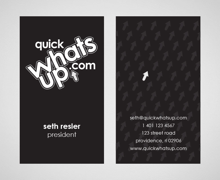
The business card was designed for Quick What’s Up. After the logo was developed, the arrow became an icon that could be exploited. The business card implemented a die cut to ampliphy the arrow. The back utilized spot uv for the repeated pattern of the arrows.