
Kathryn
Jason
Claire

Katherine
Kara

Julia
Independent Coffee / Tea Shop
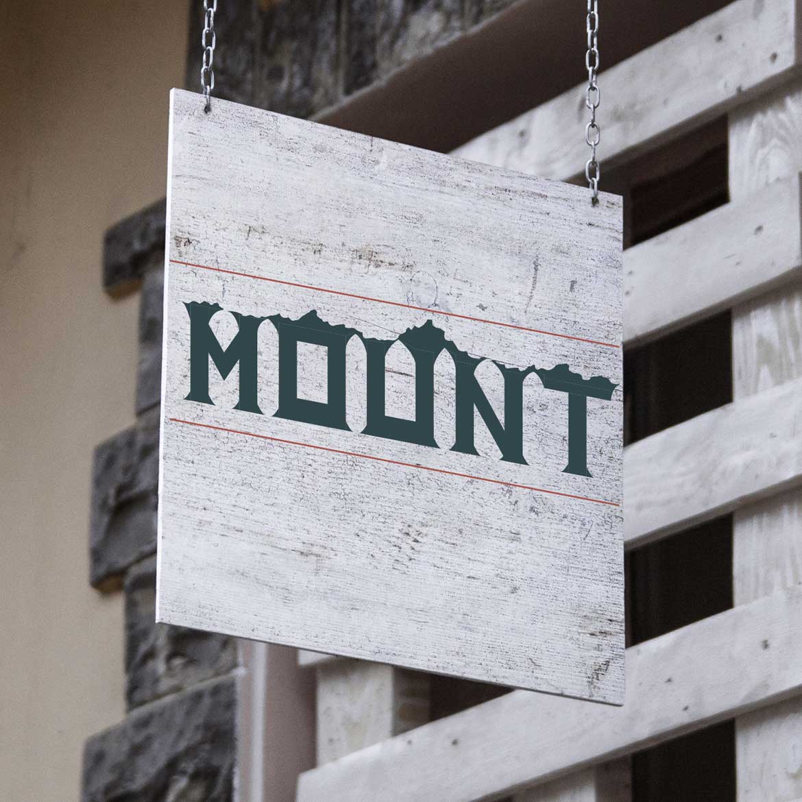
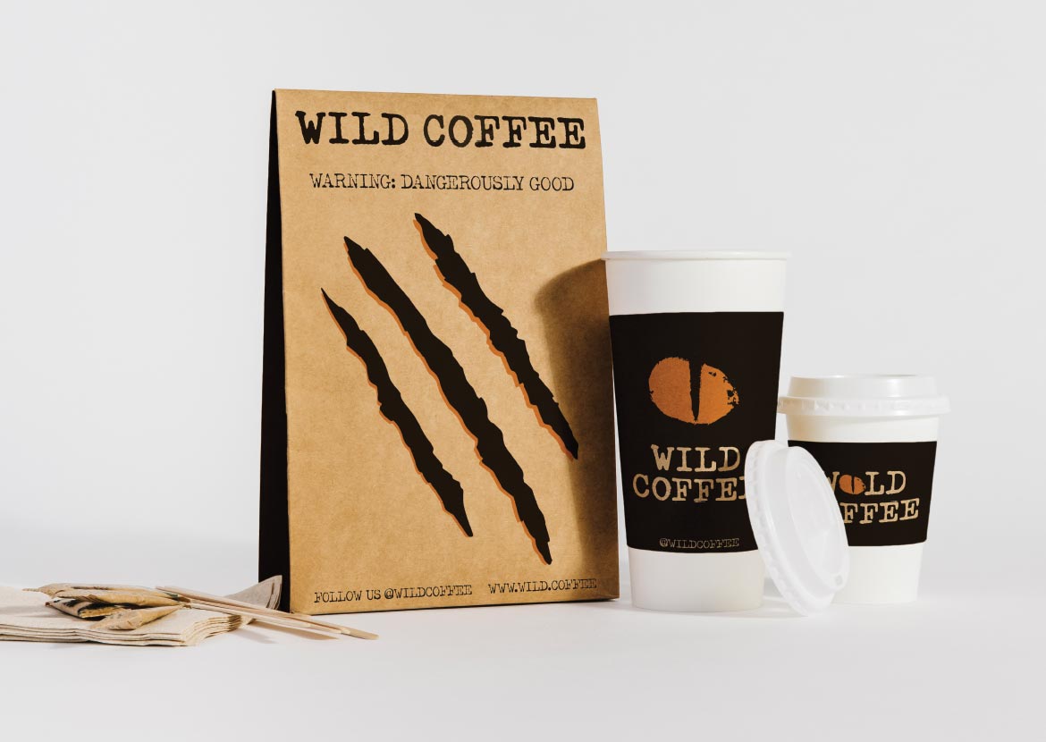
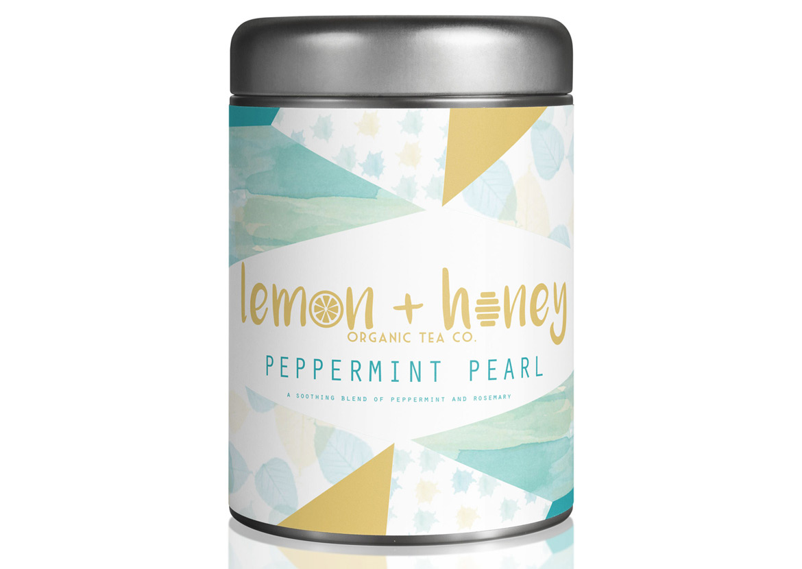
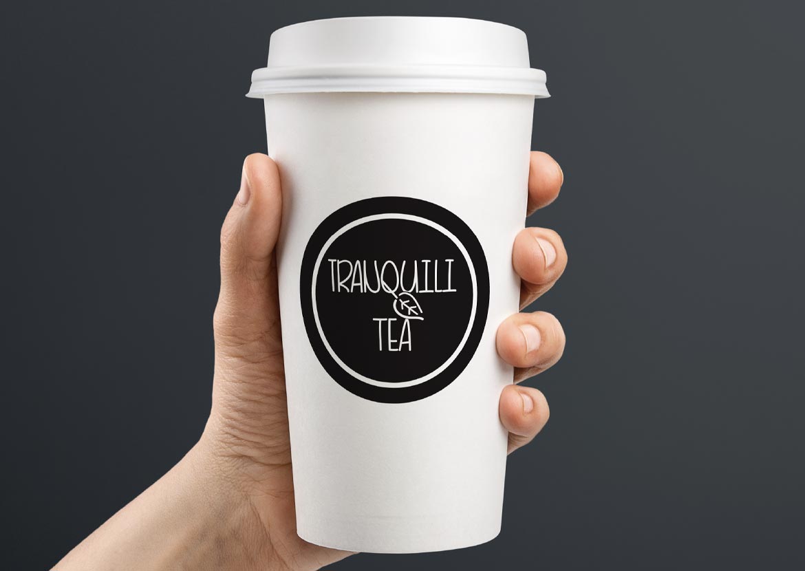
Develop the identity for an independent coffee or tea shop. This will include a logo with symbol integration, invitation to event media post, window treatment, signage, shopping bag, cup design, shirt design along with a smock design..
Download Project Handoutproject overview
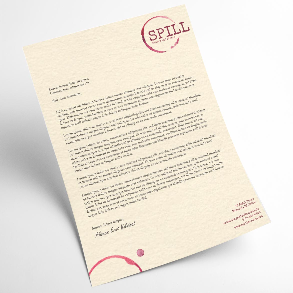
This project will focus on an independent coffee or tea shop. You are asked to develop the branding around a fictitious shop where the logo integrates an icon with the type name. This icon could then become the staple in all other designed elements. Focus solely on either coffee or tea, but not both [ or another similar business you feel would work - but must get approval on project scope ]. Think about the imagery that is synonymous with these industries. Think about the colors and typefaces that would connect to a bean or leaf for instance. Once the logo has been solidified, apply the rules you have developed and the identity to the required items.
gained knowledge
At the conclusion of this project, you will have developed the identity of a shop that is specific to their services and what they offer their customers. You will have focused on a logo design that speaks to these services and isolated an icon that was used across multiple designs echoing their brand. Applying the design across print, signage and screen printing will be explored with tight requirements when it comes to typeface usage and spot colors. You will have looked into developing a logo that can respond to any size and orientation. Breaking down the logo elements in a way that all connect to a person seeing the logo in different applications.
project requirements
- new logo development - no more than 3 spot colors, black and white logo, one color version, reversed on black background
- signage that portrays a unique shape playing off the logo / icon
- invitation to grand opening event postcard 9 x 61/2 - eddm
USPS Using Every Door Direct Mail
EDDM Postcards Layout Guidelines - invitations to grand opening social media post graphic
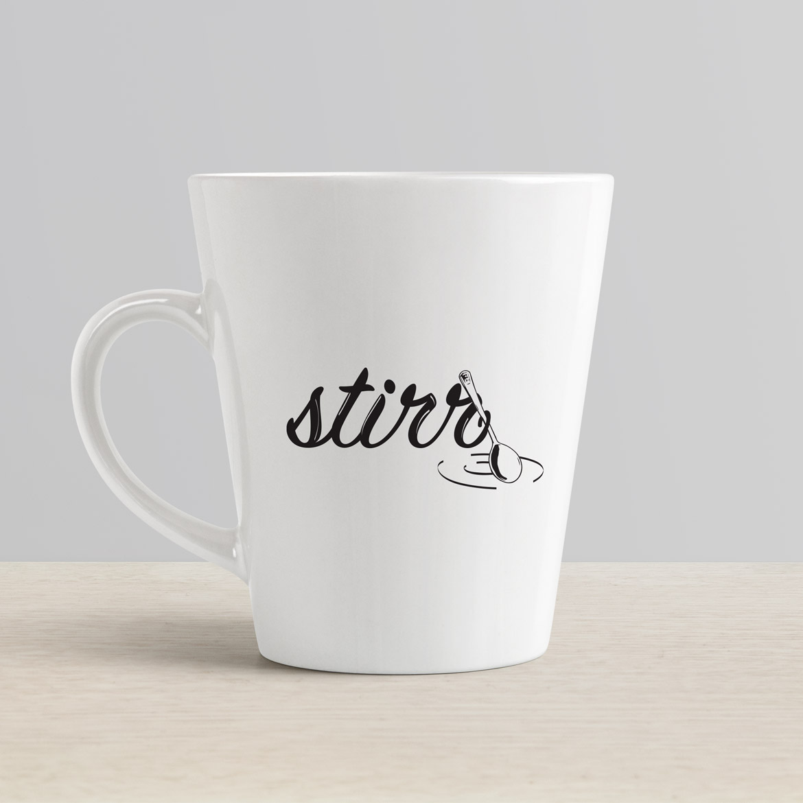
Social Media Image Sizes Cheat Sheet for Every Network/ - 2 cup designs - one for hot and one for cold - different material
- sleeve design for hot cup - one color screen - how this covers the design
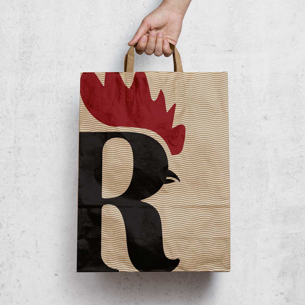
- small pastry bag - one color screen
- small pastry box - one color screen
- shirt design - screen printed
- complimenting smock design - embroidered
grading scheme
- 5 of 5 : the quality and aesthetic appeal of the logo itself
- 1 of 1 : milestone | showing 3 different renditions for logo development
- 4 of 4 : the uniqueness & creativeness of all the pieces
- 1 of 1 : milestone | showing the window treatment in an image
- 4 of 4 : strength of all the pieces as a whole - consistency
- 3 of 3 : research/process of the project - mood board development
- 2 of 2 : participation in class crit
Approach
Each project will have specified due dates during the course of the semester. The outline for each project will follow a tight schedule with multiple milestones that should be followed closely. As each aspect of a project relies on one another, falling behind will cause delays in the implementation of your rationale and solution. More importantly, not receiving critical feedback and having proper time to digest that criticism, will hinder your ability to improve and further your skills. Throughout this course, you will receive criticism and feedback from myself and other students. Learning how to digest this feedback and apply to your design is a major part of this course. Knowing and understanding how is absolutely important - but articulating the why can be argued is even more important.
During this class, you will develop brand identities from scratch. From logo development to multiple elements an entity would require, will be created for a variety of scenarios applications. The “why” must be answered throughout the process. Revisiting the look and feel that the brand is generating is important and must be documented. The entire project must work together and be a cohesive message that speaks to the entity’s message and values.
Receiving outside feedback will be important as it will either confirm your objectives or force to rework your rationale. Throughout the process, you must understand how your designs will be adapted into other applications. The logo should transcend from the digital to physical world through print and embroidery or even large scale signage or billboards.
How will the typefaces chosen hold up under these different design situations and should the type be tweaked for specific circumstances? Often when viewed on screen, type will follow a set of rules that differ when the text is seen on a large sign. What happens when your logo is placed into a social media setting and the design is squared off? Is your design extremely narrow and unable to utilize that space? Can you develop a set of rules that allows for the brand to bounce to multiple variations for different dimensions and spaces? Should your logo respond to different orientation scenarios? Will the logo work as a one color? Is the line weight too thin that falls apart when embroidered? These questions are important to consider and with each project this semester, your decisions will be forced into these different situations.
There will absolutely be last minute curve balls thrown at you during the project.
Understanding the different methods of printing standards and the software used to develop the end design pieces will be covered in more depth in each of the semester projects and assignments. Each project that will be designed in class will differ just as each student will have different taste, direction and subject. Because of this, it will allow for a much diverse range in projects that will at times have students being pushed in different directions as their project demands. Never does a one set of rules govern design just as the process and approach often will too. Certain rules can be broken and yet some absolutely must not. Learning these limitations in the process will allow for creative solutions as each of you strive to develop a truly unique brand.
Each project will be developed on screen and accompanied with multiple applications that could be a range of elements that are specific to that brand/company/entity needs. Printing out your designs and seeing how they look off screen is vital. The contrast and quality of images and color along with type readability without the back glow of the screen, can only be perfected with prints. You will be asked to use software you have already used in previous courses and throughout this semester your knowledge will be strengthened.
This class is about problem solving but more importantly understanding how your decisions and finalized executions will affect all future projects going forward. Often, a design may work perfect for one application but falter or fail in another. This will force you to back track and redevelop your ideas and direction. It is rare when a logo development is created in isolation and can work perfectly across multiple scenarios.
On project due dates, come to class with the project already completed and uploaded. We will not be printing projects to submit - though printing should be used through the design process. Projects should be uploaded before class starts on the due date.
Projects are due on a specific date and if missed, will be docked a full letter grade for every class meeting that passes. During this semester, there has to be exceptions. Please reach out to me if you are falling behind. I care about your health and well being more than imposing strict guidelines, even though I feel are important, right now can not be the most important. These projects will require work done outside of class time. Please balance your commitments and do not fall behind. You may resubmit any project for grading until the last week of classes - unless that project was handed in late.